This post contains affiliate links.
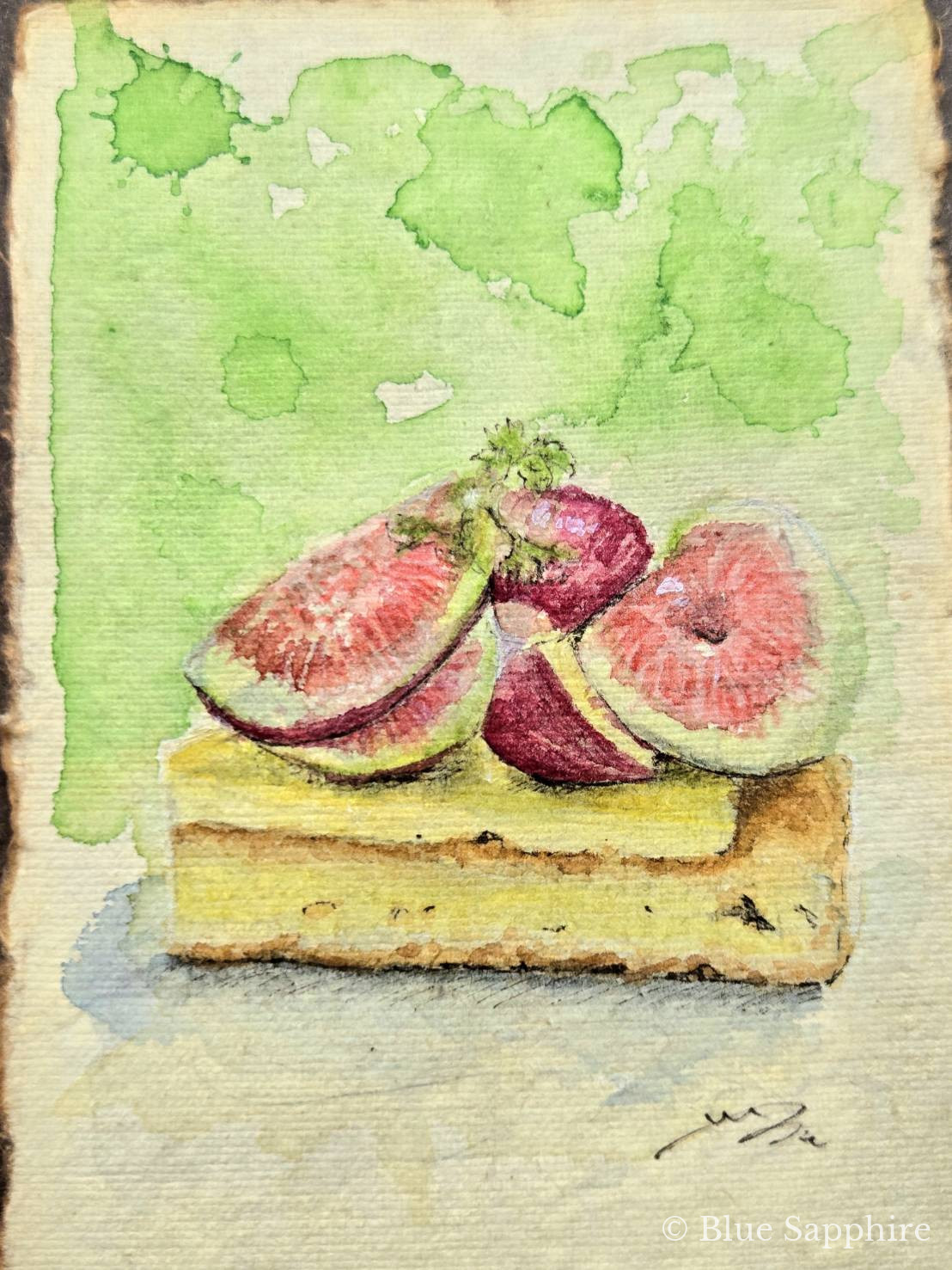
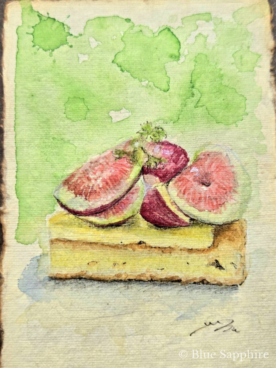
Figs were something I really disliked as a child, but somewhere along the way to adulthood they became one of my favourite fruits.
All those tiny seeds, a little grotesque… when exactly did they come to reign as such a fashionable fruit?
It had been a while since I last painted in traditional watercolour, so this time I painted a fig tart.
One small piece on 6×4 inch paper, about the size of a postcard. Today I would like to show you how this painting came to be, in the order I actually painted it.
- 1. The materials I used
- 2. 1. A rough pencil sketch
- 3. 2. Painting the shadows across the whole picture
- 4. 3. Laying colour on the figs and the tart shell
- 5. 4. Tightening only the very darkest points with pen
- 6. 5. And finally, placing the light
- 7. And then, the signature
- 8. I filmed the process
- 9. おわりに
- 10. In closing
The materials I used
- LEATHER VILLAGE watercolour paper, 6×4 inch — the paper that holds the water
- Holbein Artists’ Watercolour W405, 24-colour set — my beloved paints
- Holbein aluminium watercolour palette No.80 (26 wells) — the partner that keeps my colours ready
- Sakura Pigma, set of 5 — the pens for shadows and my signature
- Uni POSCA extra-fine, white — the pen that places the light at the very end
Besides these: a pencil and a kneaded eraser, a water brush and some tissue. That is all. The fewer the tools, the less I hesitate while painting.
1. A rough pencil sketch
First I roughly capture the shapes in pencil. I do not draw it in tightly. As long as I know “what goes where,” that is enough.
This time I placed the tart on the lower half of the paper and left the entire top as empty space. The figs are the stars, so I wanted to give them some air to breathe.
The watercolour paper here is 6×4 inches, about the size of a postcard. Large paper takes courage to face, but with paper that fits in your palm, you can simply think “let me try painting this” and begin.
Watercolour paper does not buckle even when it holds plenty of water, and it receives the bleeding of the paint beautifully. If you look closely at the background of this painting, you should be able to see the texture of the paper showing through. If you paint in watercolour, this is the one thing I would ask you to use proper paper for.
▶ See LEATHER VILLAGE watercolour paper, 6×4 inch
2. Painting the shadows across the whole picture
This may be the greatest characteristic of how I paint. Before colour, I paint the shadows.
Rather than jumping straight into the true colours, I first lay thin shadows across the whole piece and decide where the light and dark areas will be.
This makes it easier to grasp the three-dimensional form of the subject, and because the skeleton of the painting is built first, the shapes do not collapse when the colours go on later. You worry far less about thinking “oh no, the sense of volume has disappeared” each time you place a colour.
Keep the shadows a thin, bluish grey. Not brown or black — a blue-grey keeps the shadows from becoming heavy, and lets them blend into the surrounding air.
Personally I often mix “W105 MANGANESE BLUE NOVA” with “W025 BRILLIANT PINK.” Sometimes I mix the complementary colour of the subject instead.
I never erased the pencil hatching. I feel that leaving a little of the traces of my hand keeps some body warmth in the painting. Rather than finishing it perfectly, I prefer being able to see the time spent painting it.
3. Laying colour on the figs and the tart shell
The flesh of the figs
The flesh changes colour from the outside inwards. Near the skin it is a pale yellow-green, inside that a creamy tone, and at the centre a deep pink turning to red.
I lay the pale outer colours first, letting each dry as I move towards the deeper colours in the centre. Light colour → dark colour. This is the one order I always keep. Reverse it and the colours turn muddy.
Placing a deep red-purple on the skin of the fig in the middle really tightened up the contrast, I think.
The tart shell
The shell goes in three stages: yellow → golden yellow → dark brown. The cream layer on top gets a thin lemon yellow, and the pastry below gradually takes more brown, growing deeper towards the bottom. Doing this makes a flat rectangle start to look like something with real thickness.
Paints and palette work as a set
Holbein is a long-established Japanese manufacturer, and the first joy is simply how easy it is to find, both in art shops and online. The pigment particles are fine and it spreads smoothly, so the way it opens up when you load the brush with water is very beautiful.
Twenty-four 5ml tubes. Not too many, not too few. All the basic colours are there, and beyond that you mix.
▶ See Holbein Artists’ Watercolour W405, 24-colour set
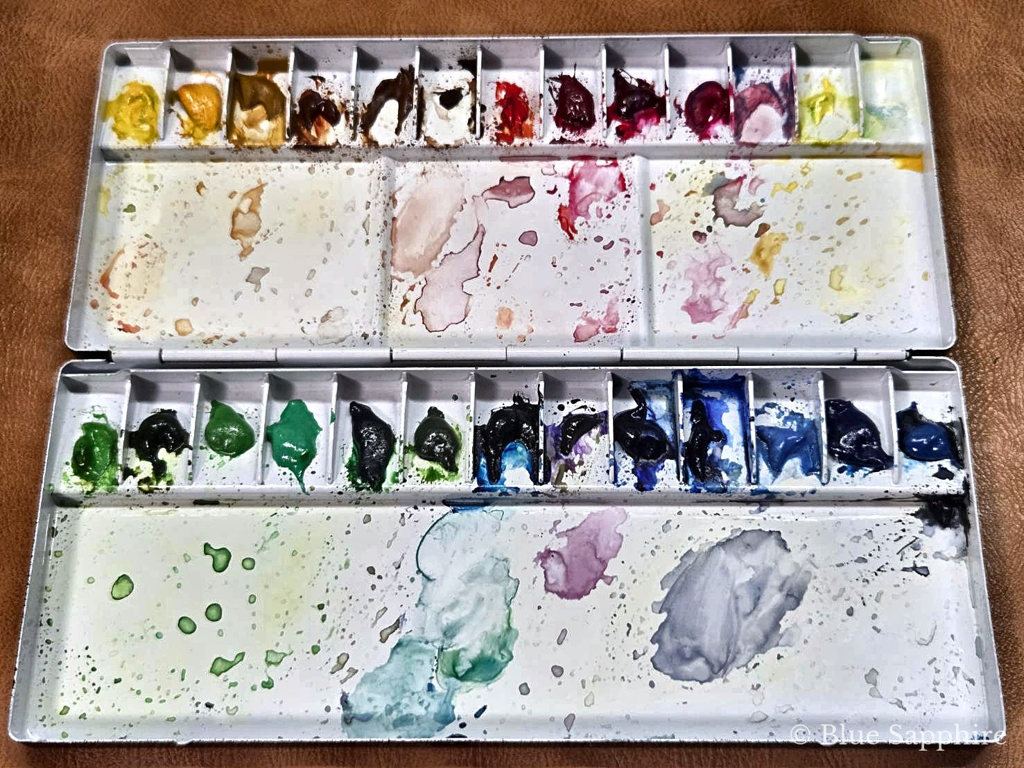
And the order in which you lay out the paints matters enormously. Arrange them in rainbow order (yellow → orange → red → purple → blue → green → brown) and the colours you want to mix sit next to each other, so you stop wasting time searching.
Once you have laid them out, never change the arrangement. When your body remembers the positions, you can pick up colours without taking your eyes off the painting.
The state of my palette after use is a little too realistic, is’nt it (laughs).
▶ See Holbein aluminium watercolour palette No.80 (26 wells)
4. Tightening only the very darkest points with pen
Now the pen comes in. This time I did not use pen for the line work. If you trace the outlines first, it starts to look like a colouring page, and I felt the softness of watercolour would die.
I only use it on the darkest parts of the painting: the shadow where the figs meet the tart, the deepest veins in the flesh, the little bubbles and shadows in the pastry.
I tighten only those single points where “nothing is darker than here.” That alone brings the whole painting sharply into focus. One touch of a black that watercolour alone can never reach, and every other colour comes alive.
I used Pigma pens. The ink is pigment-based and does not dissolve once dry, so the lines will not run even if you add watercolour on top afterwards.
What matters is not overdoing it. When in doubt, choose less. You can always add later, but you cannot erase.
I have a habit of overworking things, so this is something I watch carefully.
5. And finally, placing the light
This is the very last step. The glossy highlights on the flesh, the highlights on the fig skins. I draw these with a white extra-fine POSCA.
Transparent watercolour has no white. To be precise, white is “the colour of the paper.” So by the textbook, the correct approach is to leave the shining areas unpainted from the start.
But that feels so restrictive. Painting while thinking “I must leave this part” stops the brush from moving freely. So I paint boldly, and add the light at the end.
Masking would solve it, but with this particular paper, masking tears up the surface…
POSCA is an opaque water-based pigment marker, so the white sits firmly even on dry watercolour. With the extra-fine tip you can place even the tiniest sparkle in the flesh as a single dot.
Here too, what matters is not overdoing it.
And then, the signature
Finally I sign the piece — again with a Pigma pen.
I filmed the process
おわりに
まとめると、こんな順番でした。
- 鉛筆でざっと下絵
- 全体に影を塗る
- いちじくとタルト生地に色をのせる
- いちばん暗い部分だけペンで締める
- ハイライトを白のポスカで置く
- サインを入れる
In closing
To sum up, this was the order:
Start with the shadows, finish with the light.
Once the dark areas are decided, all that remains is laying colour and adding the sparkle at the end. Thought of that way, watercolour becomes just a little kinder.
You do not need special tools. One pad of paper, one box of paints, two pens. Buy something of the season and paint it before you eat it. That alone will keep that day with you for a long time.
If reading this has made you think “maybe I will try painting,” that is the greatest joy I could ask for. Until we meet again.
As an Amazon Associate, Blue Sapphire earns from qualifying purchases.